"Matplotlib" is a Python package with enables the creation of graphical data outputs within the Python platform. As mentioned in a prior article, in most cases, it may be easier and even more aesthetically pleasing to graph data within an Excel workbook. However, there are instances in which "matplotlib" may be able to provide a graphical variation which is un-available within other software suites.
In this article, we will examine a few different variations of graphical outputs which can be produced through the utilization of the "matplotlib" package. With the fundamentals firmly grasped, you should then possess the ability to conduct further research as it pertains to the more eclectic options which enable less frequently utilized visuals.
A link to the package website is featured at the end of this entry. There, you can find numerous demonstrations and templates which illustrate the package's full capabilities.
For demonstrative purposes, we will again be utilizing the data frame: "PythonImportTestIII".
This data frame can be downloaded from this website's GitHub Repository:
GitHub
(Files are sorted in chronological order by coinciding entry date)
The file itself is in .csv format, and must be imported prior to analysis.
All example require that the following lines be included within the initial code file:
# Enable Matplotlib #
import matplotlib.pyplot as plt
# Enable Pandas #
import pandas
Basic Line Graph
Let's start by demonstrating a basic line graph.
# Adjust output dimensions #
plt.figure(figsize=(5,5))
# Sort data by the X-Axis #
# Not performing this steps causes your data to resemble a scribble #
PythonImportTestIII = PythonImportTestIII.sort_values(by = ['VarA'])
# Plot the data #
plt.plot(PythonImportTestIII['VarA'], PythonImportTestIII['VarD'])
# Output the newly ceated graphic #
plt.show()
Not incredibly inspiring. Let's add a few more details to make our graph a bit more complete.
# Adjust output dimensions #
plt.figure(figsize=(5,5))
# Sort data by the X-Axis #
# Not performing this steps causes your data to resemble a scribble #
PythonImportTestIII = PythonImportTestIII.sort_values(by = ['VarA'])
# Plot the data #
plt.plot(PythonImportTestIII['VarA'], PythonImportTestIII['VarD'])
# Assign axis labels and graph title #
xlab = 'X-Axis Label'
ylab = 'Y-Axis Label'
title = 'Graph Title'
# Assign axis labels and graph title to graphical output #
plt.xlabel(xlab)
plt.ylabel(ylab)
plt.title(title)
# Output the newly created graphic #
plt.show()
Now let's take it to another level by adding a grid to the background of our data graphic.
# Adjust output dimensions #
plt.figure(figsize=(5,5))
# Sort data by the X-Axis #
# Not performing this steps causes your data to resemble a scribble #
PythonImportTestIII = PythonImportTestIII.sort_values(by = ['VarA'])
# Plot the data #
plt.plot(PythonImportTestIII['VarA'], PythonImportTestIII['VarD'])
# Assign axis labels and graph title #
xlab = 'X-Axis Label'
ylab = 'Y-Axis Label'
title = 'Graph Title'
# Assign axis labels and graph title to graphical output #
plt.xlabel(xlab)
plt.ylabel(ylab)
plt.title(title)
# Add a grid to the graph #
plt.grid()
# Output the newly created graphic #
plt.show()
Line Graph with Connected Data Points
If you're anything like yours truly, you'd prefer to have data points specifically displayed within the graphical output. To achieve this, utilize the following code:
# Adjust output dimensions #
plt.figure(figsize=(5,5))
# Sort data by the X-Axis #
# Not performing this steps causes your data to resemble a scribble #
PythonImportTestIII = PythonImportTestIII.sort_values(by = ['VarA'])
# Plot the scattered data #
plt.scatter(PythonImportTestIII['VarA'], PythonImportTestIII['VarD'])
# Plot the data lines #
plt.plot(PythonImportTestIII['VarA'], PythonImportTestIII['VarD'])
# Assign axis labels and graph title #
xlab = 'X-Axis Label'
ylab = 'Y-Axis Label'
title = 'Graph Title'
# Assign axis labels and graph title to graphical output #
plt.xlabel(xlab)
plt.ylabel(ylab)
plt.title(title)
# Add a grid to the graph #
plt.grid()
# Output the newly created graphic #
plt.show()
Yes, life is beautiful.
In this article, we will examine a few different variations of graphical outputs which can be produced through the utilization of the "matplotlib" package. With the fundamentals firmly grasped, you should then possess the ability to conduct further research as it pertains to the more eclectic options which enable less frequently utilized visuals.
A link to the package website is featured at the end of this entry. There, you can find numerous demonstrations and templates which illustrate the package's full capabilities.
For demonstrative purposes, we will again be utilizing the data frame: "PythonImportTestIII".
This data frame can be downloaded from this website's GitHub Repository:
GitHub
(Files are sorted in chronological order by coinciding entry date)
The file itself is in .csv format, and must be imported prior to analysis.
All example require that the following lines be included within the initial code file:
# Enable Matplotlib #
import matplotlib.pyplot as plt
# Enable Pandas #
import pandas
Basic Line Graph
Let's start by demonstrating a basic line graph.
# Adjust output dimensions #
plt.figure(figsize=(5,5))
# Sort data by the X-Axis #
# Not performing this steps causes your data to resemble a scribble #
PythonImportTestIII = PythonImportTestIII.sort_values(by = ['VarA'])
# Plot the data #
plt.plot(PythonImportTestIII['VarA'], PythonImportTestIII['VarD'])
# Output the newly ceated graphic #
plt.show()
Not incredibly inspiring. Let's add a few more details to make our graph a bit more complete.
# Adjust output dimensions #
plt.figure(figsize=(5,5))
# Sort data by the X-Axis #
# Not performing this steps causes your data to resemble a scribble #
PythonImportTestIII = PythonImportTestIII.sort_values(by = ['VarA'])
# Plot the data #
plt.plot(PythonImportTestIII['VarA'], PythonImportTestIII['VarD'])
# Assign axis labels and graph title #
xlab = 'X-Axis Label'
ylab = 'Y-Axis Label'
title = 'Graph Title'
# Assign axis labels and graph title to graphical output #
plt.xlabel(xlab)
plt.ylabel(ylab)
plt.title(title)
# Output the newly created graphic #
plt.show()
# Adjust output dimensions #
plt.figure(figsize=(5,5))
# Sort data by the X-Axis #
# Not performing this steps causes your data to resemble a scribble #
PythonImportTestIII = PythonImportTestIII.sort_values(by = ['VarA'])
# Plot the data #
plt.plot(PythonImportTestIII['VarA'], PythonImportTestIII['VarD'])
# Assign axis labels and graph title #
xlab = 'X-Axis Label'
ylab = 'Y-Axis Label'
title = 'Graph Title'
# Assign axis labels and graph title to graphical output #
plt.xlabel(xlab)
plt.ylabel(ylab)
plt.title(title)
# Add a grid to the graph #
plt.grid()
# Output the newly created graphic #
plt.show()
If you're anything like yours truly, you'd prefer to have data points specifically displayed within the graphical output. To achieve this, utilize the following code:
# Adjust output dimensions #
plt.figure(figsize=(5,5))
# Sort data by the X-Axis #
# Not performing this steps causes your data to resemble a scribble #
PythonImportTestIII = PythonImportTestIII.sort_values(by = ['VarA'])
# Plot the scattered data #
plt.scatter(PythonImportTestIII['VarA'], PythonImportTestIII['VarD'])
# Plot the data lines #
plt.plot(PythonImportTestIII['VarA'], PythonImportTestIII['VarD'])
# Assign axis labels and graph title #
xlab = 'X-Axis Label'
ylab = 'Y-Axis Label'
title = 'Graph Title'
# Assign axis labels and graph title to graphical output #
plt.xlabel(xlab)
plt.ylabel(ylab)
plt.title(title)
# Add a grid to the graph #
plt.grid()
# Output the newly created graphic #
plt.show()
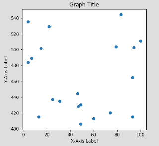
To create a pure scatter plot, utilize the code below:
# Adjust output dimensions #
plt.figure(figsize=(5,5))
# Plot the scattered data #
plt.scatter(PythonImportTestIII['VarA'], PythonImportTestIII['VarD'])
# Assign axis labels and graph title #
xlab = 'X-Axis Label'
ylab = 'Y-Axis Label'
title = 'Graph Title'
# Assign axis labels and graph title to graphical output #
plt.xlabel(xlab)
plt.ylabel(ylab)
plt.title(title)
# Output the newly created graphic #
plt.show()

Histogram
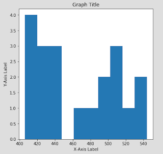
To create a histogram, try implementing the following code:
# Adjust output dimensions #
plt.figure(figsize=(6,6))
# Create a histogram for the data #
plt.hist(PythonImportTestIII['VarD'])
# Assign axis labels and graph title #
xlab = 'X-Axis Label'
ylab = 'Y-Axis Label'
title = 'Graph Title'
# Assign axis labels and graph title to graphical output #
plt.xlabel(xlab)
plt.ylabel(ylab)
plt.title(title)
# Output the newly created graphic #
plt.show()

Vertical Bar Chart
To create a vertical bar chart, utilize the code below:
# Create a vertical bar chart for the data #
plt.bar(PythonImportTestIII['VarC'], PythonImportTestIII['VarD'])
# Assign axis labels and graph title #
xlab = 'X-Axis Label'
ylab = 'Y-Axis Label'
title = 'Graph Title'
# Assign axis labels and graph title to graphical output #
plt.xlabel(xlab)
plt.ylabel(ylab)
plt.title(title)
# Output the newly created graphic #
plt.show()
Horizontal Bar Chart
The code to plot a horizontal bar chart is only slightly different:
# Create a horizontal bar chart for the data #
plt.barh(PythonImportTestIII['VarC'], PythonImportTestIII['VarD'])
# Assign axis labels and graph title #
xlab = 'X-Axis Label'
ylab = 'Y-Axis Label'
title = 'Graph Title'
# Assign axis labels and graph title to graphical output #
plt.xlabel(xlab)
plt.ylabel(ylab)
plt.title(title)
# Output the newly created graphic #
plt.show()
Conclusion
The fundamental graphics which I have demonstrated are by no means an adequate summarization of what is offered within the "matplotlib" package. All sorts of additional options exist which include, but are not limited to: error bars, color, multiple lines within a single line graph, stacked bar charts, etc. It isn't an exaggeration to state that an entire blog could be dedicated just to demonstrate the various functionalities which exist inherently with the "matplotlib" package.
Therefore, for more information related to the functionality of this package, I would recommend performing independent research related to the topic. Or, you could visit the package creators' website, which includes numerous additional templates and examples:
Matplotlib Organization
That's all for now. Stay tuned, Data Monkeys!


