Monday, August 28, 2017

(R) The Normal Distribution - Pt. II

Now that you understand how to identify a normal distribution, we can utilize R to perform calculations that are specific to this distribution type.

When a normal distribution has been identified, we can estimate the probability that an event takes place as it occurs between two values.

I am assuming that you have some understanding of normal distributions in addition to what was discussed in the prior entry.

Example:

You are currently employed as a statistician in a factory that produces flashlights. The senior statistician informs you that the premium brand of flashlights that the factory produces, have a battery life expectancy which is normally distributed. The mean for the battery life of this particular brand is 20 hours, with a standard deviation of 5 hours.

What is the probability that a randomly selected flashlight from the production line will last between 20-25 hours?

pnorm(q=25, mean=20, sd=5, lower.tail=TRUE)

# Output = 0.8413447 #

0.8413447 - .50

# 0.3413447 or % 34.134 Probability #

If a flashlight's battery dies at exactly 8 hours after use, how many standard deviations away from the mean is this value?

# (x - mean) / standard deviation #

(8 - 20) / 5

# - 2.4 Standard Deviations #

What is the probability that a randomly selected flashlight from the production line will last between 18-24 hours?

pnorm(q=18, mean=20, sd=5, lower.tail=FALSE)

# Output = 0.6554217 #

0.6554217 - .50

# Output = 0.1554217 #

pnorm(q=24, mean=20, sd=5, lower.tail=TRUE)

# Output = 0.7881446 #

0.7881446 - .50

# Output = 0.2881446 #

0.2881446 + 0.1554217

# 0.4435663 or % 44.357 Probability #

What is the probability that a randomly selected flashlight from the production line will last between 22-26 hours?

pnorm(q=22, mean=20, sd=5, lower.tail=FALSE)

# Output = 0.3445783 #

.50 - 0.3445783

# Output = 0.1554217 #

pnorm(q=26, mean=20, sd=5, lower.tail=TRUE)

# Output = 0.8849303 #

0.8849303 - 0.1554217 - .50

# 0.2295086 or % 22.950 Probability #


At the same factory, while eating lunch, the senior statistician appears again. During this encounter, he decides to test your statistical abilities by asking you a series of questions.

These questions are:

Given a normal distribution with a mean of 55, what is the standard deviation if 45% of the values are above 70?

qnorm(.45, lower.tail=FALSE)

# Output = 0.1256613 #


70 - 55

# Output = 15 #

15 / .1256613

# Standard Deviation = 119.3685 # 

Given a normal distribution with a standard deviation of 15, what is the mean if 25% of the values are below 45?

qnorm(.25, lower.tail = FALSE)

# Output = 0.6744898 #

45 + (0.6744898 * 15)

# Output = 55.11735 #

Given a normal distribution with 60% of the values above 100, and 90% of the values above 80, what are the mean and the standard deviation?

qnorm(.60, lower.tail=TRUE)

# Output = 0.2533471 #

qnorm(.90, lower.tail=TRUE)

# Output = 1.281552 #

# (100 - Mean)/Standard Deviation = 0.2533471 #
# (80 - Mean)/Standard Deviation = 1.281552 #

# 100 - Mean = 0.2533471 * Standard Deviation #
# 80 - Mean = 1.281552 * Standard Deviation #

Which can be worked out, algebraically, to solve for both mean and standard deviation.

That is all of this entry, which closes out the 50th article that I have written for this blog. Two things to remember about normal distributions: there is no perfect test for normality, and there is no way to provide a probability for a single event occurring within a continuous normal distribution. All that we can find, is the probability surrounding an event's parameters.

Stay tuned until next time, Data Heads.

Sunday, August 27, 2017

(R) Identifying Normally Distributed Data - Pt. I


A good portion of statistics, as it is taught in the academic setting, focuses specifically on a single aspect of the subject matter, that aspect being the normal distribution. Normal distributions often occur in very large observational sets, however, there are also instances where a small observational pattern may exhibit characteristics of a normal distribution. Once a set is identified as conforming to this distribution type, various inferences can be made about the data, and various modeling techniques can be applied.

For this article, we will be using the sample data set: "SDSample":

SDSample <- c(7.00, 5.10, 4.80, 2.90, 4.80, 5.80, 6.40, 6.10, 4.30, 7.20, 5.30, 4.00, 5.50, 5.40, 4.70, 4.50, 5.00, 4.70, 6.10, 5.10, 5.20, 5.00, 4.20, 5.10, 4.90, 5.30, 2.90, 5.80, 3.50, 4.90, 5.80, 6.10, 3.00, 5.90, 4.30, 5.30, 4.70, 6.40, 4.60, 3.50, 5.00, 3.50, 4.10, 5.70, 4.90, 6.10, 5.30, 6.90, 4.60, 4.90, 4.00, 3.90, 4.50, 5.90, 5.20, 7.20, 4.60, 4.40, 5.40, 5.90, 3.10, 5.60, 5.10, 4.40, 4.50, 3.10, 4.50, 6.00, 6.00, 5.10, 7.30, 4.60, 3.20, 4.10, 5.10, 4.90, 5.10, 5.60, 4.10, 5.70, 4.70, 5.70, 5.50, 4.50, 5.20, 5.00, 5.40, 5.10, 3.90, 4.30, 4.10, 4.30, 4.40, 2.40, 5.40, 6.30, 5.50, 4.30, 4.90, 2.90)

Creating a Frequency Histogram

Assuming that "SDSample" contains sample observation data, our first in analyzing the data in order to check for normality, is to create a histogram.

hist(SDSample,
freq = TRUE,
col = "Blue",
xlab = "Vector Values",
ylab = "Frequency",
main = "Frequency Histogram")


The output should resemble:


Shapiro-Wilk Normality Test

After viewing the histogram, we should proceed with performing a Shapiro-Wilks Test. This can be achieved with the following example code:

shapiro.test(SDSample)

This produces the following console output:

Shapiro-Wilk normality test

data: SDSample
W = 0.98523, p-value = 0.3298


But what does this mean?

Without an assumed alpha level, it means nothing at all. However, with a determined alpha level, a hypothesis test can be created which tests for normality. We will assume an alpha value of

Well, assuming an alpha value of .05 (α = .05), or stating that we wish to, with 95% confidence, state that the data does fit a normal distribution...through the use of the Shapiro-Wilk normality test, we can create a hypothesis test to prove just that.

If P <= .05 we would reject the null hypothesis, meaning, that we could state that:

With 95% confidence the data does not fit the normal distribution.

If P > .05, we would accept the hypothesis, meaning, that we could state that:

No significant departure from normality was found.

In this case, P = 0.3298, and 0.3298 > .05, therefore, we can state:

No significant departure from normality was found.

THE RESULTS OF THIS TEST DO NOT MEAN THAT THIS DATA WAS TAKEN FROM A SOURCE WHICH WAS NORMALLY DISTRIBUTED. NOR DOES IT INDICATE THAT THE DATA ITSELF IS NORMALLY DISTRIBUTED. IT SIMPLY STATES THAT:

Assuming an Alpha Value of .05, and applying the Shapiro-Wilk normality test, no significant departure from normality was found.

However, since the test is biased by sample size, the test may indicate statistically significant results in a large samples, even when this is not the case. Thus a Q-Q plot is required for verification in addition to the test. *

Q-Q Plot

As previously mentioned, the size of the data set that Shapiro-Wilk normality test is applied to can have a significant impact on its accuracy. This is why Q-Q plot utilization is recommended to double check the results of the test.

To create a Q-Q plot, please utilize the sample code:

qqnorm(SDSample, main="")
qqline(SDSample)


This should produce the following output:


Ideally, if the data is normally distributed, the dotted plots should follow the solid trend line as closely as possible.

The Q-Q plot is reasonably consistent with normality.

For more information on how to interpret the Q-Q plot, please click on the link below:

http://data.library.virginia.edu/understanding-q-q-plots/

Plotting The Probability Density of A Normal Distribution

Before proceeding with this coding sample, I want to be clear, that this method does not produce a Kernel Density Plot. Meaning, that the method that is presented below, will take any number of data points and plot them as if the distribution was perfectly normalized. Therefore, this graphical representation only serves as just that. Any data that is subject to the methods below will be graphed as if it the data selection occurred within a normal distribution.

First we will need to find the mean of the data vector:

mean(SDSample)

# mean = 4.940 #

Then we need to derive the standard deviation.

sd(SDSample)

# sd = 0.9978765 #

# Now we will assign the ‘SDSample’ vector to vector "x" #

x <- SDSample

# This code produces a new vector which consists of the probability density values of all "SDSample" data vector values. It does so under the assumption, that these values occurred within a normal distribution with a mean value of 4.940, and a standard deviation of 0.9978765 #

y <- dnorm(SDSample, mean = 4.940, sd = 0.9978765)

# This code plots the distribution #

plot(x,y, main="Normal Distribution / Mean = 4.940 / SD = .998", ylab="Density", xlab="Value", las=1)

# This code creates a vertical line on the plot which indicates the position of the mean value #

abline(v=4.940)

From this code, we are presented with the image:


Kernel Density Plot

In this graphic, what is being illustrated, is the density of independently occurring values on the x-axis. Notice that the illustration is not perfectly bell shaped. This was not going to be initially include this as part of this article, but I feel that it should be presented due to its significance, and also, to demonstrate how it differs from the previous example.

d <- density(SDSample)
plot(d, main ="Kernel Density of X")
polygon(d, col="grey", border="blue")


The output would be:


In the next article, we will discuss inferences that can be made pertaining to normally distributed data, and methods which can be utilized to draw further conclusions.

* https://en.wikipedia.org/wiki/Shapiro%E2%80%93Wilk_test

Monday, August 21, 2017

(R) The Poisson Distribution


In this article, we will be discussing The Poisson distribution. The Poisson distribution is a discrete distribution, and is similar to the binomial distribution. However, the Poisson distribution applies to occurrences over a specified interval. The random variable 'x' is the number of occurrences of the event in an interval.

μ or λ = (Mean or Lambda) The average number of occurrences of the event over the interval.

x = The number of occurrences of the event over the interval.

Requirements

The random variable 'x' is the number of occurrences of an event over some interval.

The occurrences must be random.

The occurrences must be independent from each other.

The occurrences must be uniformly distributed over the interval being used (cannot be seasonal).

Differences from a Binomial Distribution

The Possion distribution differs from the binomial distribution in these fundamental ways:

The binomial distribution is affected by the sample size 'n' and the probability 'p', whereas the Poisson distribution is affected only by the mean.

In a binomial distribution the possible values of the random variable x are 0,1,...,n, but a Poisson distribution has possible 'x' values of 0,1,2..., WITH NO UPPER LIMIT! (emphasis added)

* Source for the above material: https://www.youtube.com/watch?v=BR1nN8DW2Vg 
   User: DrCraigMcBridePhd Video: "Statistics - Binomial & Poisson Distributions" 

Example in R:

Let's say, that every Tuesday in spring, for 8 hours, your web camera films for blue birds which frequent your garden. You have counted these blue birds, and over the course of the season, have noticed an average of 12 blue birds visiting your garden each day.

What is the probability that EXACTLY 8 blue birds will visit your garden given the parameters of the experiment?

P(x) = 8
λ = 12

In R, this would be expressed in the code below:

dpois(x=8, lambda=12)

Which would generate the result of:

[1] 0.06552328

What is the probability that exactly 0 blue birds will visit?
What is the probability that exactly 1 blue bird will visit?
What is the probability that exactly 2 blue birds will visit?
What is the probability that exactly 3 blue birds will visit?

In R, this would be expressed in the code below:

dpois(x=0:3, lambda=12)

Which would generate the result of:

[1] 6.144212e-06 7.373055e-05 4.423833e-04 1.769533e-03

What is the probability that 6 or less blue birds will visit your garden?

P(x <= 6)
λ = 12

In R, this would be expressed in the code below:

sum(dpois(x=0:6, lambda=12))

or

ppois(q=6, lambda=12, lower.tail=T)

Either, which would generate the result of:

[1] 0.04582231

What is the probability that more than 6 blue birds will visit your garden?

P(x  > 6) 
λ = 12

In R, this would be expressed in the code below:

ppois(q=6, lambda=12, lower.tail=F)

Which would generate the result of:

[1] 0.9541777

Alternatively, you could also utilize any of the following lines of code and achieve the same result:

1 - sum(dpois(x=0:6, lambda=12))

sum(dpois(x=138, lambda=12))


In the next article we will discuss the normal distribution. I hope to see you then. All the best, data monkeys.

(R) Binomial Distribution


What R lacks in graphical capability, it makes up for in analysis, which in my opinion, is of far greater importance. Today we will discuss R's ability to streamline binomial distribution analysis.

For our example, let’s say that you have five dice. Each die has six faces, and each of those faces contains a number (1,2,3,4,5,6).

Now, for our example to qualify as a binomial probability distribution, it must meet ALL of the following requirements:

Requirements

1. The procedure has a fixed number of trials.

2. The trials must be independent.

3. Each trial must have all outcomes classified into two categories (success or failure).

4. The probability of a success remains the same in all trials.

Notation

Notation for probability distributions is as follows:

p = Probability of success. (one trial)

q = Probability of failure. (one trial)

n = Fixed number of trials.

x = The number of successes in ’n' trials.

P(x) = the probability of getting exactly ‘x’ successes among the ’n’ trials.

* Source for the above material: https://www.youtube.com/watch?v=BR1nN8DW2Vg 
   User: DrCraigMcBridePhd Video: "Statistics - Binomial & Poisson Distributions" 

So, for the sake of our example, let's say that we want to know the probability of rolling all five dice, one after the other, and having each face land showing the "6" side.

Therefore:

p = 1/6 (1 out of 6 chance that a roll of "6" will occur on one die.)

q = 5/6 (5 out of 6 chance that it will not.)

n = 5 (5 rolls will be made.)

x = 5 (5 rolls of "6" are needed.)

P(x=5) = ??? (What is the probability that all 5 rolls will show a face of "6"?)

In R, this would be expressed in the code below:

dbinom(x=5, size=5, prob=1/6)

Which would generate the result of:

[1] 0.0001286008

How about we try the same experiment, with the same parameters, except this time, we want to know the probability of rolling a “5” or a “6” on any die. Again, we will be rolling each of the 5 dice once.

# p = 2/6 (2 out of 6 chance that a roll of "6" or "5" will occur on one die.) #

# q = 4/6 (4 out of 6 chance that it will not.) #

# size (n) = 5 (5 rolls will be made.) #

# x = 5 (5 rolls of "6" or "5" are needed.) #

# P(x=5) = ??? (What is the probability that all 5 rolls will show a face of "5" or "6"?) #

# In R, this would be expressed in the code below: #

dbinom(x=5, size=5, prob=2/6)


Which would generate the result of:

[1] 0.004115226

# Now let's check the probability of not rolling a "6" on one die, given 5 trials. #

# prob = probability that event will not occur #

# The probability of NOT rolling a "6" on one die, one roll #

dbinom(x=1, size=1, prob=5/6)


Which would generate the results:

0.8333333

# Also could run the following code in each instance: #

# prob = probability that event will occur #

1 - dbinom(x=1, size=1, prob=1/6)

# The probability of NOT rolling a "6" on 2 dice, given 2 dice being separately rolled. #

dbinom(x=2, size=2, prob=5/6)

# The probability of NOT rolling a "6" on 3 dice, given 3 dice being separately rolled. #

dbinom(x=3, size=3, prob=5/6)

# The probability of NOT rolling a "6" on 4 dice, given 4 dice being separately rolled. #

dbinom(x=4, size=4, prob=5/6)

# The probability of NOT rolling a "6" on 5 dice, given 5 dice being separately rolled. #

dbinom(x=5, size=5, prob=5/6)


# Finally, let's say that you wanted to know the probability of rolling two or less "6"'s on a die face given… #

# 5 separate rolls of 5 dice #

# p = 1/6 (1 out of 6 chance that a roll of "6" will occur on one die.) #

# q = 5/6 (5 out of 6 chance that it will not.) #

# n = 5 (5 rolls will be made.) #

# x<=2 = (2 rolls of "6" are needed.) #

# P(x<=2) = ??? (What is the probability that two dice or less show the face "6"?) #

# In R, this would be expressed in the code below: #

sum(dbinom(x=0:2, size=5, prob=1/6))

# or #

dbinom(x=0, size=5, prob=1/6) + dbinom(x=1, size=5, prob=1/6) + dbinom(x=2, size=5, prob=1/6)

# or: #

pbinom(q=2, size=5, prob=1/6, lower.tail = TRUE)


Each method would produce the result of:

[1] 0.9645062

# What is the probability that 3 dice or more show the face "6"? #

dbinom(x=3, size=5, prob=1/6) + dbinom(x=4, size=5, prob=1/6) + dbinom(x=5, size=5, prob=1/6)

# or #

pbinom(q=2, size=5, prob=1/6, lower.tail = FALSE)

# or #

1 - pbinom(q=2, size=5, prob=1/6, lower.tail = TRUE)

# or #

1 - sum(dbinom(x=0:2, size=5, prob=1/6))


Each method would produce the result of:

[1] 0.9645062


Conversely, you could also generate a result which indicates the value of the probability of
2 dice having a value of "6", given five dice.

# In R, this would be expressed in the code below: #

dbinom(x=2, size=5, prob=1/6)

Which would produce the result of:

[1] 0.160751

In the next article, I will discuss a similar concept, known as the "Poisson Distribution". Stay tuned data enthusiasts.

(R) Bar Plots

In today's entry, I will briefly explain how to create basic bar plots. In future entries, the subject matter which I will cover, will pertain to formula based analysis. To re-iterate, if given the option, I would recommend creating most graphical representations through the utilization of non R related software.

The example data that we will be utilizing to create our example graphics is below:

Test1 <- c("Yes", "Yes", "Yes", "No", "No", "Yes", "No", "Yes", "No", "Yes", "Yes", "Yes", "No")

Test2 <- c("No", "No", "No", "Yes", "Yes", "Yes", "No", "No", "Yes", "Yes", "Yes", "No", "Yes")

CSVColors <- data.frame(Test1, Test2)


In the case of our first example, we will graph the first column, "Test1".

Test1 <- table(CSVColors$Test1)

In R, you have the option of selecting specific colors from which to color your bar plot. R recognizes most color names, to set up a color scheme for your graph, you may utilize the following code:

graphcol <- c("<color1>", "<color2>", "<color3>", etc.)

"graphcol" is the name of the vector that I selected for our example bar plot. However, if you'd prefer, you could use a different vector name of your choosing. As long as the "col=" option equals the name of the vector which contains the color selections, the colors should be properly applied to the graph.*

In our example, we will use the colors "Grey" and "Maroon".

graphcol <- c("grey", "maroon")

Now let's specify, within our code, that we would like these colors to be utilized:

barplot(Test1,
main="Vert Bar Plot Example", xlab="X-Axis",
ylab="Y-Axis", col=graphcol)


This should create the output:


If we would instead like to create a horizontal bar plot, the code would be modified to:

barplot(Test1,
main="Horiz Bar Plot Example", xlab="X-Axis",
ylab="Y-Axis", col=graphcol, horiz=TRUE)


The output that the above code creates is:


There are other options that can be selected to further customize the bar plot graphs. However, in this article, my goal was to simply present the basics. Again, if given the option, I would heavily suggest using a different program to graph results.

Wednesday, August 16, 2017

(R) Stemplot and Cumulative Frequency Plot

Today we will be discussing two very important graph types. The first graph is known as The Stemplot, or The Stem and Leaf Display. This representation is commonly used when preparing statistical data by hand, as it assists in the organization of data by numerical value. The second graph type that we will examine is known as The Cumulative Frequency Plot. This graph type is less common, but still finds use when comparing distribution data.

I will begin by discussing the more difficult of the two graph types, The Cumulative Frequency Plot. Learning how to decipher what is being illustrated in this display can be difficult to understand initially, as this type of graphical representation is not inherently intuitive. For this reason, I have included a link at the bottom of this article, which explains how to properly assess such a plot.*

Cumulative Frequency Plot

Before we begin, I should mention that R’s ability, as it pertains to the creation of Cumulative Frequency Plots, is rather limited. There are no built in functions which assist in creation of this graph type. There are auxiliary libraries, which do provide some useful features that can be utilized in tandem to create Cumulative Frequency Plots, however, utilizing these libraries in this manner is cumbersome and complicated. Therefore, if employed in an enterprise setting, I would recommend using a different program to create this type of graph.

After scouring the internet for a few hours and consulting the various R books in my possession, this was the best method that I could find for creating Cumulative Frequency Plots. This method was originally posted by a user named: "Yang", on the website: "Stack Exchange". A link to the original post can be found below. **

For this code to work, you will need to first download the R library, “ggplot2”.

qplot(unique(<datasetcolumn or vector>), ecdf(<datasetcolumn or vector>)(unique(<datasetcolumn or vector>))*length(<datasetcolumn or vector>), xlab='X-Axis', ylab='Y-Axis', main = "Cumulative Frequency Demo" , geom= c("point", "smooth"))

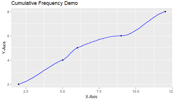
If were to employ this method while utilizing our example data vector 'F' to create a sample table, the output would resemble:


The code for the creation of such is below:

# Example Vector F' #

F <- c(5,12,9,12,5,6,2,2)

# The Code to Generate the Example Table #

qplot(unique(F), ecdf(F)(unique(F))*length(F), xlab='X-Axis', ylab='Y-Axis', main = "Cumulative Frequency Demo" , geom= c("point", "smooth"))

The Stemplot


Creating a Stemplot is much easier, the code for the creation of such is:

stem(<datasetcolumn or vector>)

If were to utilize this function on our example data vector 'F', the output would be:


In the case of the stem plot, the output is generated and printed to the console window.

And the code to accomplish this example product is:

stem(F)

In the next article, I will continue to demonstrate various graphical models, and the code which enables their creation.

https://www.youtube.com/watch?v=TwGYLQ-DNdc

** https://stackoverflow.com/questions/3544002/easier-way-to-plot-the-cumulative-frequency-distribution-in-ggplot

Tuesday, August 15, 2017

(R) Histogram and Box Plot

As promised, today we will be discussing two types of R graphs, The Histogram and The Box Plot. I also have created an R function that can be utilized to distinguish outliers.

Box Plot

For this example, we will be using data vector 'F'. Feel free to follow along, the code that creates vector ‘F' is below:

F <- c(5,12,9,12,5,6,2,2)

To create a vertical box plot, the following example code can be utilized:

boxplot(F, main="Box Plot", ylab="Box Plot Demo")

F: is the data vector.
‘main =‘ Displays the title of the graph.
‘ylab =‘ Provides the title of the y-axis.


If we were to graph vector 'F' through the utilization of the code above, the output would resemble:


If you wanted to use the same vector to create a horizontal box plot, you would use this set of code:

boxplot(F, main="Box Plot",  xlab="X-Axis title",  ylab="Box Plot Demo", horizontal = TRUE )

The outcome of the above code resembles:


In this case, we adding an x-axis title with 'xlab=', and additionally, we are also changing the 'horizontal=' option to TRUE. By default, this option is FALSE.

These are just basic examples of box plots, there are many other features and customizable options that can be utilized to create the perfect box plot for your needs. If would like more information on these options, please utilize the '?boxplot' option within R.

Tracking Outliers

In R, outliers for box plots are defined as values that fall 1.5 * IQR below the first quartile, and 1.5 * IQR above the third quartile. Though these appear in the graph, they are not defined by R when plotted. To find out what these outlier values are, if such values exist, I have created the following function:

OutlierFunction <- function(t) {

q1 <- fivenum(t)
q1 <- q1[2] #Q1

q3 <- fivenum(t)
q3 <- q3[4] #Q3

iqrange <- q3 - q1

out1 <<- (q1 - (iqrange * 1.5))
out2 <<- (q3 + (iqrange * 1.5))

lowout <<- subset(t, t < out1, na.rm=TRUE )
highout <<- subset(t, t > out2, na.rm=TRUE )

}


The vector, or data frame column that you wish to assess, must be passed into the function through the utilization of the call:

OutlierFunction(<dataframecolumn or vector>)

The outliers which fall below the left whisker of the box plot are stored in the permanent data vector 'lowout'. The outliers which are above the right whisker of the box plot are stored in the permanent data vector 'highout'.

Histograms

I have created two examples which demonstrate R's capacity to create histograms.

This example demonstrates a histogram which measures density along the Y-Axis:

hist(F,
freq = FALSE,
col = "Green",
xlab = "X-Axis Label",
main = "Hist Demo")

F: is the data vector.
'freq =' Specifies the histogram type.
'col =' Specifies the color of the graph.‘xlab =‘ Provides the title of the x-axis.
‘main =‘ Displays the title of the graph.

Here is the graphical output for this example code:


This example demonstrates a histogram which measures frequency along the X-Axis:

hist(F,
freq = TRUE,
breaks = 4,
col = "orange",
xlab = "X-Axis Label",
main = "Hist Demo")

F: is the data vector.
'freq =' Specifies the histogram type.
‘breaks =‘ Specifies the number of cells of the histogram.
'col =' Specifies the color of the graph.‘xlab =‘ Provides the title of the x-axis.
‘main =‘ Displays the title of the graph.

Here is the graphical output for this example code:


The main differentiation between the two is the 'freq=' option. If the option is labeled as TRUE, the histogram plots frequency. If FALSE, the histogram plots density.

Additionally, there are times that you may want to add vertical lines to assess central tendency. The code for adding these lines to an existing histogram can be found below:

# Adds a black line with a width of '3' which indicates the mean value #
abline(v=mean(F), col="black", lwd = 3)

# Adds a red line with a width of '3' which indicates the median value #
abline(v=median(F), col="red", lwd = 3)

In the next entry, I will discuss Stem and Leaf Plots and Central Frequency Plots.

Sunday, August 13, 2017

(R) Central Tendency

In this article, I will be discussing R's ability to perform the various methods that are necessary to determine central tendency. I will be using two data vectors as examples to generate the values discussed within this entry. To follow along, please create the following vectors by utilizing the following lines of code:

x <-c(53,46,61,97,44,87,40,15,29,99,85,98,17,3,46,25,15,19,2,32,67,34,39,100,88,40,40,87,89,86,69,67,89,84,98,43,75,66,40,76,48,82,45,99,10,59,15,13,99,45,78,66,59,26,2,91,80,42,94,12,9,24,37,14,18,86,35,96,56,50,22,39,58,82,11,56,50,30,99,64,74,13,14,7,5,97,59,91,57,69,58,36,43,77,36,2,58,86,89)

y <- c(1,1,1,2,2,2,3)


summary()

Summary is a useful R function, in that it provides the user with console output pertaining to the value that was initially passed to it.

Summary will print to the console:

Min (the smallest value within the set)
1st Qu. (the value of the first quartile)
Median (the median value)
Mean (the mean value)
3rd Qu. (the value of the third quartile)
Max (the max value)

If were to utilize this function while passing to it the value of 'x', the following information would be generated and printed to the R console window:

summary(x)

Min. 1st Qu. Median Mean 3rd Qu. Max.
2.00  29.50   53.00    53.15 82.00    100.00

If you wanted to generate each value independently, you could use the following functions:

mean()

For the mean value.

median()

For the median value.

range()

For the lowest and highest values.

Finding the Mode

Unfortunately, R does not have a standard function contained within its library that can be utilized to generate the mode. However, after careful searching, I found a very good substitute. The code is below. This code was taken from a YouTube user named, economicurtis. It was featured in his video: "Calculating Mode with R Software (More on R's Summary Stats". A link exists to this video at the end of the article.*

temp <- table(as.vector(<vectorname>))
names(temp)[temp == max(temp)]

The first line creates a new table for the data vector, and the second line generates the value. If the data is bi-modial, two values will be generated. Here is an example of the code with 'y' being utilized as the vector value.

temp <- table(as.vector(y))
names(temp)[temp == max(temp)]

Since 'y' is bi-modial, the output that is printed to the console window should be:

[1] "1" "2"

Finding the Variance

To derive the variance from a vector, the following function can be utilizied:

var()

Finding the Standard Deviation

This funciton can be used to derive the standard deviation from a vector:

sd()

Tukey's Five Number Summary

This function provides sample percentiles, which can be useful in descriptive statistics:

fivenum()


For example, if were to use this function on x:

fivenum(x)

The following information would be printed to the console window:

[1] 2.0 29.5 53.0 82.0 100.0

(2.0) The first value is the smallest observation.
(29.5) The second value is the value of the first quartile.
(53.0) The third value is the median.
(82.0) The fourth value is the value of the third quartile.
(100.0) And the final value is largest obervation.

Interquartile Range


The interquartile range, or IQR, is the value between the third and first quartiles. This value can be derived with the following function.

IQR()

In the next article, we will begin graphing box plots, and histograms.

* - https://www.youtube.com/watch?v=YvdYwC2YgeI

Thursday, August 10, 2017

(R) Misc.

Before I begin writing entries pertaining to data modeling, there are a few final concepts that I would like to review. In this article, I will be discussing different methodologies that were not included in my previous entries. These concepts are nevertheless important, and should be mentioned before progressing on to more difficult tasks.

Saving Work

When exiting R-Studio, you will be presented with a few options pertaining to saving data form the current session. The first prompt will ask if you want to save your current R script file. This file has an .R extension, and contains the code that you created during your session.

Upon re-starting R Studio, you should notice that all of the objects and scripts that you were previously working on, have been loaded into the platform. This occurs due to the R workspace image file. R workspace files are automatically loaded into R Studio, and contain information pertaining to your prior session. This file can be located within your R working directory, and has the assigned name ".RData".

If you wanted to manually create an .RData file with a unique name from the R console, you could utilize the command:

save.image("<filename>.rdata") 


.Rhistory is another R-Studio file. This file contains the console log from the previous session. This file can be opened and viewed with WordPad or other text editing software.

To exit R from the command line, the following command can be used:

q()


Saving Data

If you would like to save one of the data sets that you have recently edited as an R Data Frame, this can be achieved with the following line of code:

save(<dataframename>, file=<filepathway>.rda”)

Example:

save(DataFrameA, file="C:\\Users
\\Desktop
\\DataFrameA.rda")

Subsequently, if you would like to re-load this data, the following code can be utilized:

load(“<filepathway>")

Example:

load("C:
\\Users\\Desktop\\DataFrameA.rda")

However, if you would prefer to have your data saved in a format that can be accessed by programs other than R, you may want to consider saving your data as either a comma separated value file, or as a tab delineated file. The code for accomplishing such is below:

# Saving a as a comma separated value file #

write.table(<Dataframename>, file = "<filepathway>.csv", sep = ",", col.names = NA, row.names = TRUE)

Example:

write.table(DataFrameA, file = "C:
\\Users\\Desktop\\DataFrameA.csv", sep = ",", col.names = NA, row.names = TRUE)

# Saving a as a tab delineated file #

write.table(<Dataframename>, file = "<filepathway>.tsv", sep="\t")

Example:

write.table(DataFrameA, file = "C:
\\Users\\Desktop\\DataFrameA.tsv", sep="\t")

The options: (col.names = NA, row.names = TRUE), prevents a common formatting error from occurring which causes column output to be mislabeled.


Installing Packages and Enabling Packages

If you wanted to download and install packages directly by using the command line interface, you could do so with the following code:

install.packages("<packagename>")

If you would like to use an auxiliary package within your code, you would first have to enable it during your current R session. This can be accomplished by running the code below:

library(<packagename>)


Clear 'R' Workspace

If you would prefer to have a clear workspace during your current R session, you may utilize the following code:

rm(list=ls(all=TRUE))

Clear ‘R’ Console Log

If you would like to clear the log of the ‘R’ console, and you are using a Windows PC, simply press the following keys simultaneously to do so:

Ctrl (+) L

Disable Scientific Notation in ‘R’ Console Log Output

If you would like to disable ‘R’ from outputting data which is scientifically notated, you may utilize the following code:

options(scipen = 999)

Set Zero Values to NA

NA values are not included in R calculations, therefore, it may be useful at times, to change 0 values to NA. This can be achieve with the code below:

<DataFrameName$Variable>[<DataFrameName$Variable> == 0] <- NA

Example:

BaseballPlayers$HR [BaseballPlayers$HR == 0] <- NA

The next article will begin a series of articles pertaining to data modeling within R. Please stay tuned to this blog, as I can promise you that the next batch of entries will be incredibly useful for your data endeavors.

Saturday, August 5, 2017

(R) Functions

The function concept, as it exists within R, is probably the most difficult concept that exists within the R programming language. Moving forward, future entries will address various statistical models, and how to create them within the R platform.

R Functions 

I will be creating this description based on the assumption that you have some understanding as to how a function operates.

In the case below, we are first defining the function "Test_Function". Test_Function will be the name of the function that is called to run the code contained within the braces "{" and "}". In the example function, the value of "X" is being assigned as a value to "Q".

Test_Function <- function(X) is indicating to R, that Test_Function is a function. The "function()" that follows the "<-", provides this definition. The (X) after the function definition, "function(X)", is indicating to R, that "X" will be the value that will be passed into the function.

# The sample data frame below will be utilized throughout the exercises provided: #

A <- c(1,1,1,2,2,3,3)
B <- c(6,5,4,3,2,1)
PlayerID <- c(11,12,13,44,55,16,71)
HR <- c(0,4,6,2,7,10,4)

BaseBallPlayers <- data.frame(PlayerID, HR)

# The Code Below Defines the Function #

Test_Function <- function(X)
{
Q <<- (X)
}

# Run the Function #

Test_Function(B)

# The Variable 'Q' now contains 'DataFrameA' #

Q


"Test_Function(B)" illustrates an example of a function being called. Being "called" is synonymous with being initiated.

In our example, “B” is being passed into the function as it is called. This means that every entry within data vector variable “B”, will now stored within (global) variable “Q”. This is achieved through the usage of "<<-", which informs R that "Q" is to exist as a permanent value.

Here is another function example:

Test_Function2 <- function(Y)

{
Star <<- c(ifelse(Y$HR > 5, "X", " "))
}

BaseBallPlayers$Star <- Test_Function2(BaseBallPlayers)


In this example, we will assume that you are working with a data frame that contains information pertaining to baseball players. The "Star" vector will contain player information pertaining to home run hitting abilities. If a player has hit more than 5 home runs, the vector will mark his place on the list of values with an "X".

It should be mentioned before continuing, that R is strange in the way that it returns values from functions. In the above example, a vector is being created from a column which existed in an already established data frame. (Y) is the variable value that will be replaced by the value of whatever variable is passed into the function. However, without the "<<-", which existed in the above function, R will not return the value as it exists outside of the function. Meaning, that the code within the function will be processed, but the variable which is created as a product of such, will cease to exist after the function has completed its process.

For this reason, you will need to assign the function, and the variable which will be passed to the function, to a new variable prior to calling the function. This allows R to store the variable, which would previously have lived a temporary existence, to a permanent location.

Now for our final example, we'll pretend that you are working with the same player data frame. However, in this scenario, you want to generate the previous vector, and then add it to the existing data frame as a new column. The code for achieving such is below:

Test_Function3 <- function(w){
Star <- ifelse(w$HR > 5, "X", " ")
w$Star <- Star
return(w)
}

BaseBallPlayersA <- Test_Function3(BaseBallPlayers)


In this example, we are returning the value of "w". The reason for such, is that without the utilization of return, the variable that is being assigned the value of “w", would be a vector and not a data frame. Why this is the case is somewhat complicated, but stay with me while I explain it.

Test_Function3 <- function(w){
Star <- ifelse(w$HR > 5, "X", " ")
}


This creates the “Star” variable within the function. Remember, this variable would be temporary unless assigned as a part of the function being called.

w$Star <- Star

Here, the temporary value is being assigned to a new temporary data frame, which will contain it.

If we leave out the return, the temporary value will be the ultimate product of the function, and this value will be assigned to the outside variable. However, with the return specified, R is instructed to return the value of “W,” which has now been modified by the function. However, the modified variable W, still needs a place to stay, as it is temporary, and that is where:

BaseBallPlayersA <- Test_Function3(BaseBallPlayers)

Comes in.

Functions are useful in that they can be utilized to automate every day activities. Or from a more pragmatic standpoint, they can be used to generate daily reports.

In the next article, we will cover a few miscellaneous aspects of R that were overlooked in previous articles, but are nevertheless useful. Subsequently, we will proceed to delve into statistical models, and the R code required to generate reports based on such.

Thursday, August 3, 2017

(R) Using R like SAS

If you are like yours truly, making the transition from SAS to R can leave you longing for certain aspects of the former. It isn’t that R can’t perform many of the similar functions which were native in SAS. However, some of the features that were cornerstones of SAS, are much more obscure in R. This article attempts to highlight some of those key features, and introduce their R equivalents.

# To perform the first series of exercises, please create the sample data frame below: #

ID <- c(1,2,3,4,5,6,7,8,9,10)
Age <- c(19,25,31,30,33,18,22,28,29,30)
H <- c(20,26,18,10,9,12,18,19,20, 11)
HR <- c(5,2,7,5,5,1,1,0,0,10)

BaseballPlayers <- data.frame(ID, Age, H, HR)


Using Conditionals to Subset

In SAS, you can use SQL to subset data sets. Additionally, you also have the ability to create subsetted data sets by utilizing the DATA statement.

For example, if were working with a data set that contained information pertaining to baseball players, and we wanted to create a new set based on players who have hit more than 5 Home Runs, then the code would resemble:

Data HomeRunGreaterFive;
    Set BaseballPlayers;
Where HR > 5;
Run;


In R, the code to perform this function would appear as:

HomeRunGreaterFive <- subset(BaseballPlayers, HR > 5)

In SAS, if you wanted to create a new data set based on players who have more than 15 Hits OR 1 Home Run, the code might be assembled such as:

Data HitsAndHomeRuns;
    Set BaseballPlayers;
Where H > 15 OR HR > 1;
Run;


In R, the code would look like:

HitsAndHomeRuns <- subset(BaseballPlayers, H > 15 | HR > 1)

Finally, if you were programming in SAS, and wanted to create a new data set containing players who have more than 15 Hits and 1 Home Run, the code could be compiled as:

Data HitsAndHomeRuns;
    Set BaseballPlayers;
Where H > 15 AND HR > 1;
Run;


In R, the code would be:

HitsAndHomeRuns <- subset(BaseballPlayers, HR > 5 & H > 4)

Using Conditionals to Delete a Row

This refers to the code statement “delete” in SAS. Such as “IF Age > 30 THEN delete”. Delete, when used in SAS, deletes rows of data that do not match the conditional statement. So, for example, let’s say that you wanted to subset an existing set of baseball players based on player ages. In this scenario, we'll assume that you wanted to create a new set of data that did not include players that were older than 30. This would be achieved with the following SAS code:
Data PlayersYoungerThirty;
    Set BaseballPlayers;
If Age > 30 then delete;
Run;

In R, this code would resemble:

PlayersYoungerThirty <- BaseballPlayers[!(BaseballPlayers$Age > 30),]

Dropping Variables

Again we will return to our baseball example. In SAS, you have the ability to remove variables from a data set by utilizing the drop statement. For this scenario, let’s imagine that you wanted to create a new data set that did not include the eighth, ninth, and tenth variables of an existing data set, as those variable contained extraneous data that was un-needed for your summary set. In SAS, this code would probably look something like:

Data NewCleanSet (Drop = ID age);
    Set BaseballPlayers;
Run;

In R, we can reference those columns by order, and the code would resemble:

# Remove variables: ID; Age #

NewCleanSet <- BaseballPlayers[c(-1, -2)]


Perform a Left Join

R has its own native equivalents for performing data merges. However, the left join, in my opinion, is the cleanest way to accomplish this task. While a "join" is an aspect of SQL, it can be utilized within SAS through the utilization of PROC SQL. If we were going to utilize “left join” to merge two tables within SAS, through SQL functionality, the code would resemble:

proc sql ;
    create table NEWJOINEDTABLE as
    select A.*, B.*
    from TABLEA as A left join TABLEB as B
    on A.DATAONE = B.DATATWO
;
quit;

Now, I’ve done quite a bit of research into how to emulate this functionality within R. The best, hands down approach for accomplishing a similar result, requires the SQLDF package. Once you have that package downloaded, you can perform almost any SQL function within R.

The code above, with the SQLDF package downloaded and enabled, would translate into the R code below:

# Create Example Data Frames: #

DATAONE <- c(1,2,3,4,5)
DATAA <- c("A", "B", "C", "D", "E")

TABLEA <- data.frame(DATAONE, DATAA)

DATATWO <- c(1,2,3,4,5)
DATAB <- c("Spade", "Club", "Diamond", "Heart", "Joker")
TABLEB <- data.frame(DATATWO, DATAB)


# 1. Enable package: 'sqldf' #

library(sqldf)


# 2. Perform Left Join #

NEWJOINEDTABLE <- sqldf('select A.* ,
B.* from TABLEA as A
left join TABLEB as B
on A.DATAONE = B.DATATWO')

Utilizing PROC FREQ

I searched far and wide for a decent replacement for the absolutely superb PROC FREQ statement of SAS. The closest that I could come to the original SAS iteration, requires a package. Therefore, for this method to work, you will need to download the ‘gmodels' package. Also, make sure you have it enabled when running the R code equivalent. 

In SAS, the code to generate a frequency table containing home run information from DataTableA is:

Proc Freq Data = DataTableA;
    tables HR;
Run;

In R would look like (with 'gmodels' downloaded/enabled):

library(gmodels)

CrossTable(DataTableA$HR)

Adding Leading Zeroes

Always a problem, regardless of system, losing leading zeroes, and subsequently having to re-add them, is truly a burden on any data professional. There is an entire entry on this blog, on how to accomplish this in SAS. Here is how to accomplish re-adding leading zeroes in R. Please be aware, that if your column data contains numerical information, that utilizing this method changes the data to character type.

# Example Data Frame #

modifiedVar <- c(1,2,3,4,5,6,7,8)

DATAFRAME <- data.frame(modifiedVar)


# Code #

DATAFRAME$modifiedVar <- sprintf("%04d", DATAFRAME$modifiedVar)


%04d specifies the total length of the variable.

So if the above code was being utilized to on the following column variables, the following results would occur:

Old Var = 1
New Modified Var = 0001

Old Var = 10
New Modified Var = 0010

Old Var = 100
New Modified Var = 0100

If you wanted to add additional zeroes, you would simply need to change the “%04d” option to a larger value.

Dropping Tables

This code is a native SQL function. However, I still use it within SAS by utilizing the PROC SQL statement.

If you wanted to drop three tables within SAS though the usage of the drop statement, the code would resemble:

Proc SQL;
    drop tableA, tableB, tableC;
quit;

To achieve the same result while using R:

rm(DATAFRAME, BaseballPlayers)

Fixing Dates

Finally, we come to dates, which to every SAS user, is the bane of their existence. I will not go through how to modify SAS dates in this article, as there is an independent post dedicated to such on this blog. However, below are four different lines of code.

# Example Data Frames #

DateA <- c("01/20/2020", "02/13/1980", "03/30/1970", "04/13/1991")

DataFrameA <- data.frame(DateA)

###################################################

DateB <- c("01/25/2020", "02/21/1980", "05/30/1970", "09/13/1998")

DataFrameB <- data.frame(DateB) 

These two lines are for changing the data type of variable columns, within an existing data frame, to a date type format.

DataFrameA$DateA <- as.Date(DataFrameA$DateA, format="%m/%d/%Y")

DataFrameB$DateB <- as.Date(DataFrameB$DateB, format="%m/%d/%Y")


Once this is accomplished, you have the ability to create a new column, which will contain the number of days elapsed between the two dates:

DataFrameA$DaysDifference <- difftime(DataFrameA$DateA, DataFrameB$DateB, units = 'days')

You could also perform a similar function, and generate a new column which contains the number of weeks elapsed:

DataFrameA$WeeksDifference <- difftime(DataFrameA$DateA, DataFrameB$DateB, units = "weeks")

The next article should be posted within a few days, I have yet to decide on a specific topic to discuss. In the interim, please continue to visit my blog, I appreciate your patronage.